Thursday, October 6, 2016

Principles of Exposure: Capturing Action and Controlling Motion Blur


Exposure: Shutter Speed, Aperture, ISO:
Exposure is the measure of light falling on the media, be it film or CCD. It's controlled by three factors namely shutter speed, aperture and sensitivity of the sensor (ISO). Let me try to explain each of these in a greater detail.

Shutter Speed is the amount of time the shutter screen remains open, in other words, it is the duration for which the light hits the media. Shutter speed is the feature of the camera and not the lens. Faster the shutter speed, lesser the duration for which light hits the sensor, so lesser amount of light is captured.

The shutter speeds range from 1/4000th of a second (1/8000 on a pro camera) to 30seconds, with a special "B" (bulb) mode wherein the shutter could be kept open as long as the photographer wishes (of course, constrained by battery).

The shutter speed controls another most important aspect - freezing the subject in time. Simply stated, you shoot a speeding car with slow shutter speed, you tend to see the trails of the car resulting from motion blur. On the other hand you shoot the same car with higher shutter speeds, the car will appear as though it is stationary. In case you're wondering what magic, the photographer has done to capture those long trails of headlights, the answer is simple: he would have just kept the shutter open long enough to capture the trails.

When you're shooting with slower shutter speeds (under 1/100th of a second) holding the camera, it is highly likely that you end up with a blurred photograph. Why? It's obvious that when you're shooting at lower speeds, even the slightest camera shake will contribute to the blurring of the photograph. Solution for this problem is to mount the camera on a tripod or try to find a platform nearby to place the camera and shoot.

The answer for the question "What shutter shutter speed to use for a particular shot?" is "It entirely depends on the kind of shot and it can't be generalized". If you're shooting birds, wildlife, sports, street shots etc. which require the moment to be captured tack sharp use high shutter speeds. Night shots, trail capture, abstract photographs, light painting, milky waterfall photographs etc. require slow shutter speeds.
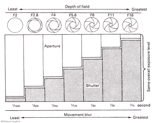
Aperture is the feature of the lens and has nothing to do with the camera, except that the aperture values are set/controlled by the camera. As the name itself suggests, aperture is an "opening" at the rear end of lens through which the light enters the camera. Earlier days, the lens barrel had an aperture ring to set the required aperture values, but these days the aperture could be controlled by the knobs on the camera or changing a setting on the digital menu of a DSLR.


The maximum and minimum value of aperture depends, as mentioned earlier, on the lens and not on the camera. You may find a lens with aperture as big as f1 or f1.4 or as small as f45 or f64. Aperture is measured in terms of f-stops and hence the f. It's notated f/1.8 or f/5.6 as well. As you can see the size of the aperture is inverse to the value of f-stop, higher the f-stop smaller the aperture, smaller the f-stops bigger the aperture. So at f1.8 the light received by the medium will be more than f5.6; least light will be received at the smallest aperture say F22 of F45 or whatever your lens supports.


Like shutter speed, aperture also controls one other aspect, apart from the amount of light, it's called Depth of Field (DOF). You maybe confused by amateur photographers who are fond of terms like DOF, Bokeh, Hyperfocal distance etc. Just remember this rule of thumb & don't get lost in the jargon: Bigger the aperture, smaller (shallower DOF) the region of focussmaller the aperture larger (deeper DOF) the region of focus. You may, therefore, want to open up the aperture for a portrait shot wherein you want a focused and sharp face and blurred background and close down the aperture for a landscape shot wherein you want the entire landscape to be focused. Also in macro shots, the amount of DOF is very critical since the available DOF is very less. DOF is used sometimes to give artistic effects to the photographs.
Photo credit: Seth Wilson 2013
Portraits would come out well with bigger apertures (smaller f-stops) for it makes the subject really sharp against a background of soft background, Also night shots usually require bigger apertures which would allow lot of light to enter.

Landscapes need smaller apertures (bigger f-stops) for most times it wouldn't have a specific focus point. Smaller apertures help on a very bright day to cut-off excess light entering (of course this could be controlled by shutter speed too).


ISO is the measure of sensitivity of the media (film) and digitally is a camera dependent feature. ISO values are typically in the range of 100 to 3200 (on a pro camera it can have an extended range from 50-102400)

When the ISO is set to 100 the sensor is the least sensitive, it can sense less light. When it's set to 1600 or 3200, the sensor can sense a much more light. Which means for a given condition if ISO 100 gives a standard exposure with F8.0 & 1/250th of a second, ISO 1600 may give a standard exposure at F8.0 & 1/1000th of a second. ISO comes very handy while shooting hand-held under low light conditions, it gives an advantage of slightly faster shutter speeds which helps in avoiding motion blur.

An obvious question may arise to a novice, "Why should I shoot at low ISO when higher ISO gives an advantage of faster shutter speed?" Though ISO seems to be such a cool feature, it carries with it something very undesirable - NOISE. Higher the ISO, higher the noise.

Brighter the ambience smaller the ISO (unless you want grainy effect), darker the ambience higher the ISO.


To Make It Easy Just Remember The Rule of Equivalent ExposureEach Change In ISO Is Equal To One Full F-Stop
Imagine you've pointed your camera at a scene and it's recommending the following settings:
  1. A shutter speed of 1/100s 
  2. An aperture of f/5.6 
  3. A sensitivity setting of ISO 400 

We could make the photo appear twice as bright by doing any of the following:
  1. Doubling the shutter speed to 1/50s 
  2. Doubling the area of the aperture by increasing it one full f-stop, to f/4 
  3. Doubling the sensitivity setting to ISO 800 
Any of these could be described as increasing the exposure by 1 stop.

Likewise, to make the scene appear half as bright, we can reduce the exposure by 1 stop by taking one of the opposite steps: 
  1. Halving the shutter speed to 1/200s 
  2. Halving the aperture area by reducing it one full f-stop, to f/8 
  3. Halving the sensitivity to ISO 200. 
Note that we use the word "stop" even when we're not adjusting the f-stop (aperture) setting. It's just become a general term to mean a factor of 2.


Key Assignment 5: Capturing Action
Students, your new assignment is a challenge for you to demonstrate an understanding of the basics of exposure through capturing action and controlling motion blur. Create images that meet the criteria listed below

Assignment Deliverables:

This pelican was shot with a fast shutter speed to capture it in motion, even the water droplets splashing up are frozen in time. Photo credit Will Tierney 2015
1- Object Frozen in Time: Create 2-3 images of a moving object that is frozen in mid-action, this image must show no motion blur. For each image write a short description of the process used in taking the photo, what settings were used to create the visual effect and describe the affect the image may have on the viewer.


A fire spinner creates a silhouette of herself through motion blur. Photo credit Seth Wilson 2005
2- Object in Motion: Create 2-3 images that show an object in motion. The moving object must show motion blur. For each image write a short description of the process used in taking the photo, what settings were used to create the visual effect and describe the affect the image may have on the viewer.


3- Tracking Motion: Create 2-3 images that shows an object in motion with the background behind the object showing motion blur. For each image write a short description of the process used in taking the photo, what settings were used to create the visual effect and describe the affect the image may have on the viewer.


4- Zoom Blur: Create 1 image that shows zoom blur by cranking the zoom and taking a photo at the same time, try it a few times and post your best. For each image write a short description of the process used in taking the photo, what settings were used to create the visual effect and describe the affect the image may have on the viewer.

Post all images with accompanying written content to the flickr group when complete.

Due by following thursday...

- Mr.W

Thursday, September 29, 2016

Photography and Color: Theory and Application


Color Theory Part A - Research and Slideshow:
Create a slide show using google doc slides, or any presentation software you prefer. Complete a slideshow that demonstrates the concepts and topics listed below. 

Assignment Specifications:
Create a slideshow that displays examples of the images listed below. Use the internet to research and find the images and incorporate them into your slideshow. Be prepared to discuss how the images achieve their appearance, is it caught in camera or created in post processing? How does the color dominance in the image affect the mood or emotion of the image, does it communicate a story and is the story altered by the color dominance?
  • Show 3 images that display Primary Colors
  • Show 3 images that show Secondary Colors
  • Show an image that displays Complimentary Color
  • Show an image that displays Analogous Color
  • Show an image that displays intense or saturated color
  • Show an image that displays desaturated or muted colors
Make your presentation visually interesting and be ready to present and discuss the images you are showing.

Presentations are due by the following thursday, email them to your instructor or turn in via usb thumb drive for credit.


Color Theory Part B - Color Palette Generation From Photograph:
In the study of color theory, primary colors refer to the 3 or 4 color combinations that all other colors can be derived from. In photography, an image can have cool, warm, light, dark, saturated or unsaturated primary colors. In this short project we will extract the colors that make up our image. From that palette we can choose pleasing color combinations for layout purposes.

Step 1: Choose one of your own images you have taken for this to use in this exercise

"Wearever whale" Image created by Seth Wilson 2012

Step 2: Navigate to this online palette generator, and upload your image as a JPG file. Here is the link : http://www.cssdrive.com/imagepalette/


Make sure you click "choose file" and upload your image....

Look for this link near the bottom of the page...

Step 3: After your image is done uploading, look at the palette it created for you, then download that palette as a Photoshop ICO File.


Step 4: Now switch over to photoshop. Create a document about 1000X900 pixels at 72 dpi. Copy-paste your photo into it, scale it down and leave some room on your document for your color palette. You will be creating shape layers and filling them with color from your custom color palette.


Step 5: On your Color Swatch / Sub-Menu, choose Replace Swatches...


Step 6: Navigate to the Photoshop ICO file you downloaded from the palette generator website.


Your color swatch tab should show your custom color palette loaded up, with no other colors available (you can change it back by choosing "reset swatches" from the submenu later on).


Step 7: After your palette is loaded, use a shape tool to draw a square, circle etc...


Step 8: Draw 1 object, then switch to the Move Tool and Option-Drag a copy....


With the Move Tool selected, and your object Layer selected... hold the option key and drag your copy...


Step 9: Continue this process.. each time you create a new object, select a new color from your custom palette by clicking on the swatch. Then you can use the Option-Delete command to fill with that color, or go to the Edit Menu / Fill / Using Foreground Color...


Continue this process until you have 20 different objects... fill these objects with the most dominant colors you see in your custom swatch palette.


Final Step: Add your name and some cool title text to your design and save it as a JPG and post to the group.


- Mr.W

Wednesday, September 21, 2016

Key Assignment 3: Static and Dynamic Composition


Hello Students,

To further our comprehension of photographic composition we will strive to develop an understanding of  the use of static and dynamic compositions with attention paid to creating a center of interest.

To summarize, static composition means that the majority of he lines and elements in the frame are horizontal or vertical. Theory dictates that the horizontal and vertical lines have a calming and soothing effect on the observer. Static compositions can be symmetrical or asymmetrical.

Conversely dynamic compositions occur when the elements in the frame are arranged in diagonal lines, which can have the effect of being somewhat unsettling on the observer. Dynamic compositions can denote movement, energy, excitement, vibrance.

To paraphrase: when the primary line of movement is horizontal or vertical the composition is static. When the primary movement is diagonal the composition is dynamic.

When it comes to composition each photo should have only on principal idea, topic or center of interest to which the viewers eyes are attracted. Subordinate elements within the picture must support and focus attention on the principle feature so it alone is emphasized. A photo without a dominant center of interest or one with more than one dominant center of interest is puzzling to the observer. Strive to frame your composition with a dominant "point of interest".

Key Assignment 3 - Static and Dynamic Composition:

Part 1: Create a series of static compositions that emphasize a point of interest, with other elements maintaining a supporting or subordinate roll 

Create 2 static photo compositions: Still life and portrait

  • Create a still life of objects found in your home and arrange them into a static composition. Focus on creating parallel planes through the use of space between your objects while maintaining emphasis on a dominant subject
  • Create a portrait of 2 people and pose them into a static composition. Pay attention to light, background, foreground and strive to emphasize vertical and horizontal alignments while maintaining emphasis on a dominant subject


Create 2 static photo compositions: Landscape and architecture
  • Create a landscape photo showing natural features in your local area framed as a static composition. Strive for horizontal and vertical lines and elements while maintaining emphasis on a dominant subject
  • Create a static photo composition using local architecture. Strive for horizontal and vertical elements while maintaining emphasis on a dominant subject


Part 2: Create a series of dynamic compositions that emphasize a point of interest, with other elements maintaining a supporting or subordinate roll.

Create 2 dynamic photo compositions: Still life and portrait
  • Create a still life of objects found in your home and arrange them into a dynamic composition. Focus on creating parallel planes through the use of space between your objects
  • Create a portrait of 2 people and pose them into a dynamic composition. Pay attention to light, background, foreground and strive to emphasize vertical and horizontal alignments

Create 2 dynamic photo compositions: Landscape and architecture
  • Create a landscape photo showing natural features in your local area framed as a dynamic composition. Strive for diagonal lines and elements, or elements to recede or advance to create a diagonal compositionwhile maintaining emphasis on a dominant subject
  • Create a dynamic photo composition using local architecture. Strive for dynamic angles while maintaining emphasis on a dominant subject
Part 3: Written Essay

Write 3-4 Paragraphs about your images and attempt to cover these topics in your essay:

  • Explain how your static images achieve composition
  • Explain how your dynamic images achieve composition
  • For each image describe the dominant element or point of interest
  • Describe how the subordinate elements support the dominant elements in each image
  • For each image describe at least 2 elements or principles of art that or being utilized, or any other compositional concept
  • Post your essay with your favorite image

Due by next Thursday...


Student Examples: Static


Student Examples: Dynamic


Thursday, September 8, 2016

Key Assignment 2: Principles and Elements of Art and Design in Photographic Composition


Art and design elements are the basic units or building blocks of a visual image. The principles of art and design govern the relationships of the elements used and also organize the composition of a visual image as a whole. All imagery, art, design and photography alike, are comprised of elements that can be broken down and analyzed.  Look over these posters, the first addresses the principles, the second addresses the elements and provide visual representations for examples of these concepts. Continue scrolling down for written explanations in more detail. Your second key assignment utilizing this knowledge is listed below...


The Elements of Art and Design
Space: Space refers to the distances or areas around, between or withing components of an image. It can exist in two or three dimensions. Space can refer to positive space(a shape, such as an apple) or negative space (the absence of an apple shape). It can also refer to elements in the foreground, mid or background of an image.

Line: Line is the basic element and refers to the continuous movement of a point along a surface, such as a pencil or brush. Line can also be created by the edges of other shapes. Lines can vary in length, thickness and direction. Line can create style, texture and varying levels of definition or emphasis.

Balance: In the sense of "visual weight" Balance can either be symmetrical or asymmetrical. The balance of an image can affect the focal point of an image. The location of objects, their sizes and colors, textures and shapes all affect the perception of balance in an image. Think of shapes. colors, textures and type as having a "visual weight" and use that sense to "feel" out your design.

Color: Color and particularly, contrasting color is used to draw the eyes attention to certain areas. It can invoke mood and emotion. Color is created in many different ways... but in all color spectrums, there are primary colors, which all other colors are derived from, and secondary and tertiary colors. Certain formula’s exist for choosing colors that are pleasing to the eye, one way is using Complimentary Colors, which appear opposite each other on a color wheel. Colors can be perceived as “Warm” such as reds, yellows and oranges, other colors are “Cool” such as purples, greens and blues.

Shape: Shapes are what give objects their definition. Think of the silhuoette. Shapes can be organic (curved, soft, random) or geometric (angular, sharp, organized, complex).

Texture: Texture is perceived surface quality. In art two types of texture exist, tactile and implied. Tactile texture is the way a surface actually feels, such as sandpaper or tree bark. Implied texture is the way the surface of an object “looks” like it feels. This is created with different pencil and brush techniques. In the modern digital realm, texture is a strong ally in design.

Value: Value is an element that refers to the relationship between light and dark. It can also be referred to as tone or shading. The value of an object helps give it form and depth. 

The Principles of Art and Design
Unity: Unity refers to a sense that everything in a piece of work belongs. It can be referred to in the literal sense of course, or just by the way balance, repetition and other elements acheive a design harmony.

Variety: The use of dissimilar elements. Differences in shape, texture, color, line etc.

Repetition: This refers to the recurrence of elements within a piece. Color, lines, shapes and other elements can be echoed, often with some subtle variation to maintain interest. Repetition can be random or organized, or express rhythm and patterns.

Harmony: Harmony is acheived through the sensitive balance of variety and unity. Harmony in color can be acheived by using complementary or analagous colors. Harmony in design is reflected in consistency in style, similarity of components. Harmony can also extend to the use of texture, color, scale etc.

Contrast: Contrast is the occurrence of differeng elements, such as color, value, scale etc. It creates interest and helps direct the focal point. Contrast helps define depth and space as well. Objects that are closer to use appear lighter, and objects that are farther away often appear darker.

Proximity: This refers to the physical placement of objects or elements in a piece. Proximity is used to communicate ideas like relation, importance or hierarchy.
Proportion: Proportion involves the relationship between objects. It is relative to size and scale. Proper proportion is important in implying realism, and skewing proportion can force the viewers perspective to change. One classical expression of proportion is the “Golden Ratio” in mathematics and the arts. Throughout history, the ratio for length to width of rectangles of 1.6 (roughly) has been considered the most pleasing to the eye. 

Functionality: In the design world, good design is created for a purpose. This is the difference between art and design. Art is created for the aesthetic value, while design is created to communicate. Art is developed by artists often to satisfy personal motivation. Design is created by designers, for clients, to communicate a message or information. Good design must be aesthetically pleasing as well as informative.


This image is at least 6 different principles and elements of art, can you define which ones?
Photo credit: Seth Wilson 2015 "Faire Apples" 
Key Assignment 2 - Explore the Principles and Elements of Art and Design Through the Lens of Photography:
For this assignment you will capture images that demonstrate and emphasis the principles and elements of art and design. You will also present them as a 2 separate photo grids with a short essay describing how each element or principle is being demonstrated.


Simple photo grid created with Fotor. Photo credit: Seth Wilson 2015
Assignment Part A: Capture and Composite Images that Demonstrate Principles of Art Design
  • Capture 7 different photos that demonstrate the following principles of art and design:
    • Line
    • Shape
    • Form
    • Space
    • Color
    • Value
    • Texture
  • Arrange the photos into a grid using photo editing software such as photoshop or lightroom. If you don't have access to that software you can download and install Gimp for free, an open source image editing program, or utilize a simple browser based photo editing website such as Fotor.
  • Write at least one sentence that explains each principle and how they are demonstrated or utilized in their corresponding images (You can post the  image to the class Flickr group and attach your essay to the image details or add it as a comment).
Assignment Part B: Capture and Composite Images that Demonstrate Elements of Art Design
  • Capture 9 different photos that demonstrate the following principles of art and design:
    • Balance
    • Harmony
    • Rhythm
    • Movement
    • Emphasis
    • Contrast
    • Variety
    • Unity
    • Proportion
  • Arrange the photos into a grid using photo editing software such as photoshop or lightroom. If you don't have access to that software you can download and install Gimp for free, an open source image editing program, or utilize a simple browser based photo editing website such as Fotor.
  • Write at least one sentence that explains each element and how they are demonstrated or utilized in their corresponding images (You can post the  image to the class Flickr group and attach your essay to the image details or add it as a comment).
This assignment is due and must be ready for review and critique by the next class meeting...

Thursday, September 1, 2016

Welcome to the ROP Digital Photography Satellite Course for Fall 2016

Hello Students,
Welcome to ROP's first satellite online/in-class digital photography course. In this course we will be studying exposure principals, composition, studio lighting, portraiture and creation of a photo essay.

Your Instructor, Mr.Wilson
Classes will meet in-class on 1 day a week for hands-on exercises and course work discussions, review and critique. Students will have access to class equipment during meeting days but will be required to use their own cameras, computers and internet access to complete online assignments each week. Students must provide transportation to and from class during in-class days. Students will post work and complete discussions on the course flickr group. Students will need a yahoo account to post work.

Students should check in with this website for new assignments and will post work for review, critique and grading online.

Introduction Assignment:
For this first assignment students will introduce themselves on the class Flickr group with an artistic image and an introduction.

Assignment Details:

  • Create or utilize your Yahoo email account to sign up for or log into Flickr
  • Request to join the class Flickr Group Page and wait for approval
  • When access is granted navigate the the group page and upload your artistic image to the Photo section, make sure your image is tagged with the word: artistic
  • When your image is uploaded navigate the the group Discussion area and type in your introduction to the post titled "Group Introduction Page", you will find instructions for completing your introduction in the first post written by me, your instructor.
Photo Credit: Seth Wilson 2015 "Blue Moon"

Key Assignment 1: Pareidolia and Balance
Your first key assignment is a study in pareidolia. Pareidolia is the perception or recognition of a specific pattern or form in something that is essentially different. In this case we will be looking for faces in objects or faces in everyday places and buildings/architecture. When an artist uses elements of pareidolia in a painting or illustration it can have a double-meaning. In photography the same effect can occur if the photographer sees the right conditions for it. Check out the samples below...


Reading Assignment:
Complete this reading assignment in order to be able to identify the types of balance used in your and others photographic compositions. Identifying balance in your work is part of the assignment requirements.

Link 1: New York Film Academy -  5 types of balance in photography
Link 2: Photography Life - Balance in photography

Photography and Writing Assignment Details and Requirements:
  • Walk the campus, your neighborhood or home looking for hidden faces in buildings, plumbing, fixtures, bookcases, trees, etc... capture the images with attention being paid to composition, lighting, color, angle, emotion and most importantly balance.
  • Take many shots (10-20) and choose your 4 best.
  • Post your 4 images to the Flickr group with the tag pareidolia (spell it correctly!)
  • For each image you post write a short paragraph describing the the artistic methods your image displays, what kind of balance it is utilizing and what emotion does your pareidolia display (happiness, fear, rage, etc...) and how that affects the composition. Include these paragraphs in the details section when posting your image.
  • Make comments on 4 images of other students providing constructive criticism or compliments on the photographers usage of composition, lighting, color, balance, etc... stay constructive and/or positive.
  • Project is due wednesday

Grading Specifications for a total of 10 possible points:
      2 points: All 4 shots posted with paragraphs and tags
      2 points: All 4 shots are properly exposed
      2 points: All shots show attention to balance, composition, light, exposure
      2 points: Work posted on time
      2 points: Constructive criticism, feedback and compliments posted to 4 other images